Client
Kunuvita
Industry
Food & Beverages
Services Provided
– Label Design
– Logo Design
– Strategy
– Creative Direction
Reimagining a Traditional Drink for the Modern Health-Conscious Consumer
Kunuvita set out to introduce a healthier take on Kunu, a beloved West African beverage enjoyed across generations. The challenge was creating packaging that honored the drink’s cultural roots while appealing to a modern audience seeking healthier beverage alternatives.
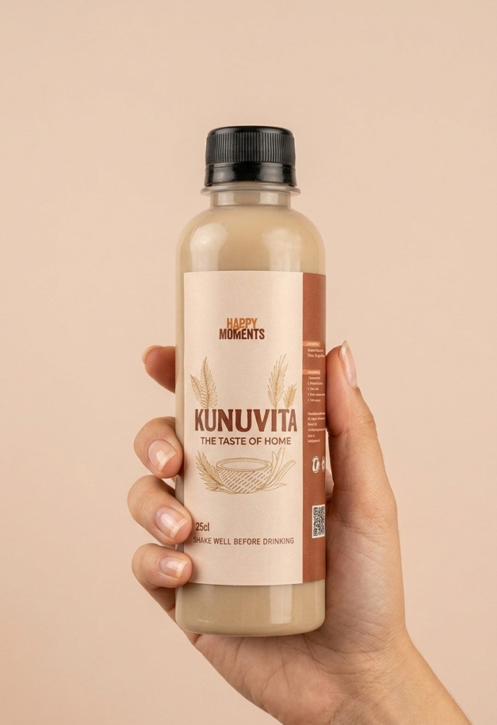
The design process began with understanding the product, its ingredients, target market, and competitive landscape. Research revealed an opportunity to move away from the overly busy packaging commonly found in the category and instead create a clean, vibrant, and premium look that immediately communicated freshness, health, and authenticity.
Through multiple design explorations, we developed a packaging system that balanced cultural familiarity with modern design principles, ensuring the product would stand out on shelves while remaining approachable and trustworthy.
The Goal & Outcome
The goal was to create packaging that would:
- Position Kunuvita as a healthier alternative within the beverage market.
- Communicate freshness, quality, and natural ingredients.
- Appeal to both traditional Kunu drinkers and younger health-conscious consumers.
- Increase shelf visibility and brand recognition.
- Establish a visual identity that could support future product expansion.
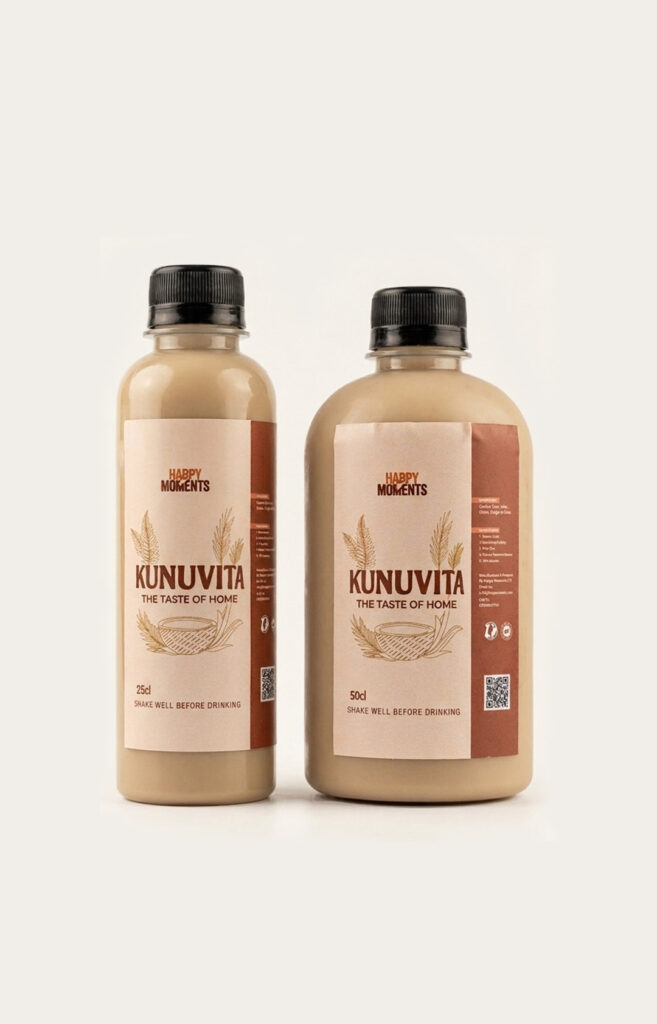
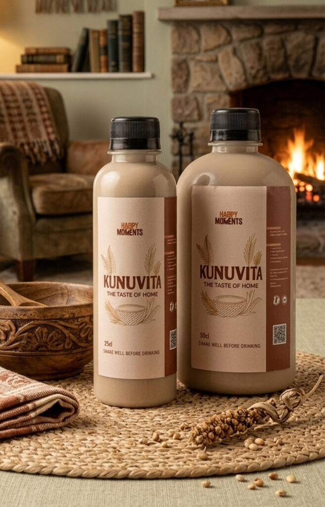
The final packaging transformed Kunuvita into a brand that feels both authentic and contemporary. Through strategic use of color, typography, and product imagery, the design clearly communicates the drink’s health benefits while maintaining a strong connection to its cultural heritage.
The result is a packaging system that feels fresh, premium, and memorable—helping Kunuvita stand apart from competitors and creating a strong foundation for future growth and product development.
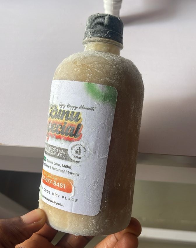
The old design presents an amateurish, cluttered aesthetic that fails to capture the product’s natural essence. It suffers from a disjointed visual hierarchy, featuring an outdated 3D text effect with harsh drop shadows and a generic liquid splash that looks more like milk or paint than Kunu. Additionally, random blurry green elements and a jarring, web-style orange call-to-action button compete with multiple conflicting fonts, ultimately stripping the label of any professional or artisanal identity. All of these and more needed to be changed to give Kunuvita a premium look
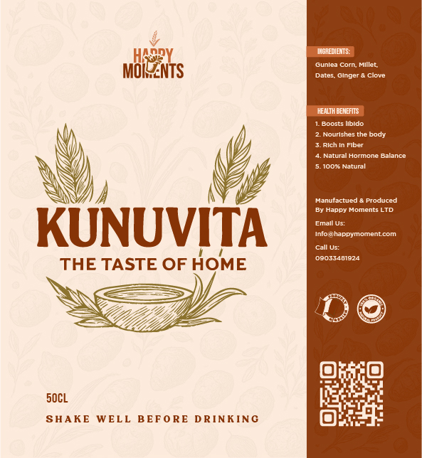
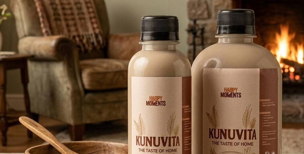
In stark contrast, the new design elevates the brand into a premium, retail-ready space by embracing a cohesive, earth-toned color palette of cream and deep brown. It replaces the chaotic elements with elegant, hand-drawn line art of grain stalks and a traditional calabash bowl that perfectly honors the product’s heritage. With clean typography, a well-organized side panel for ingredients and health benefits, subtle background patterns, and modern additions like trust badges and a QR code, this layout tells a sophisticated story that commands a premium price point.